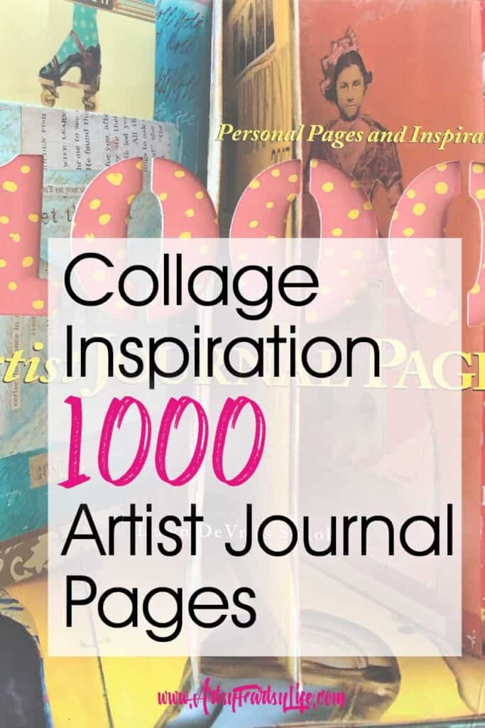
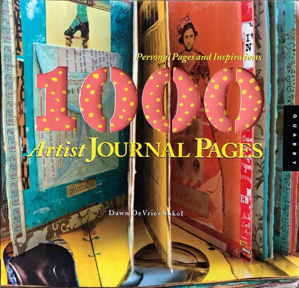
There are a million mixed media journal page examples on Pinterest, but sometimes I just want to flip through a book for inspiration when I am doing a daily journal page! This 1000 Artist Journal Pages book is an amazing resource when you are thinking about doing a new project.
Using Art Books For Inspiration
Artists throughout time have used others' artwork as inspiration. According to Lisa Marder, who studied drawing and painting at Harvard...
One of the tried and true techniques of classical art training is to copy the work of the Old Masters, those who painted before the 18th century. source
Seeing as how it has gone for millennia, I love picking a piece of art and then choosing a couple of elements to try in my own mixed media journal pages!
Butterfly Mixed Media Journal Page
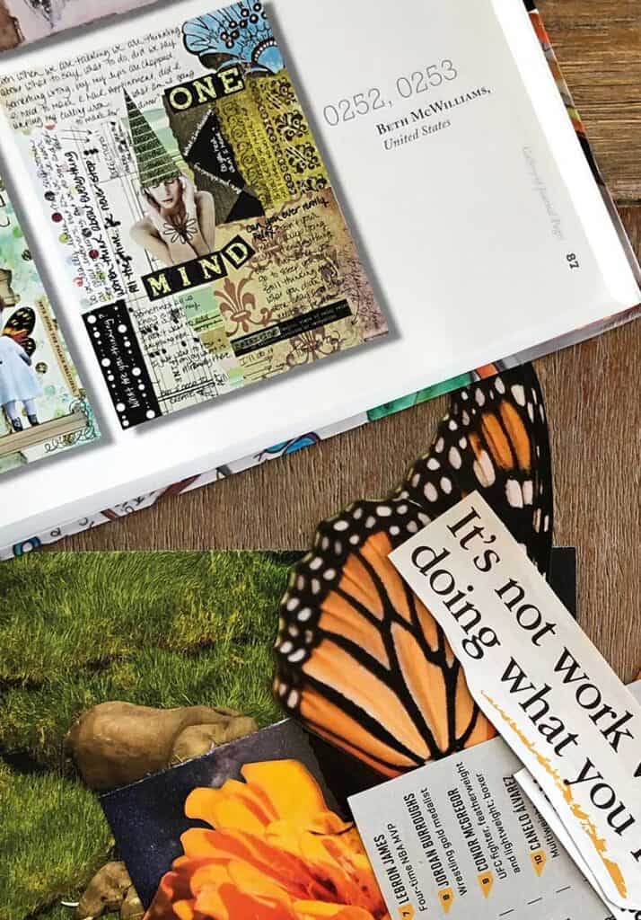
Today I used 1000 Artist Journal Pages as my inspiration. I found a piece by Beth McWilliams that was fun!
I pulled a couple of images and words that I would use in my piece. The elements of her artwork that I liked were:
- two main images as focal points
- dark places with white text
- big and little white dots
- color blocks with writing in them
- lots of text and journaling
Here is the page that I came up with mid-process. I think I got all the elements... two main focal points, color blocks, black areas and some cut out words.
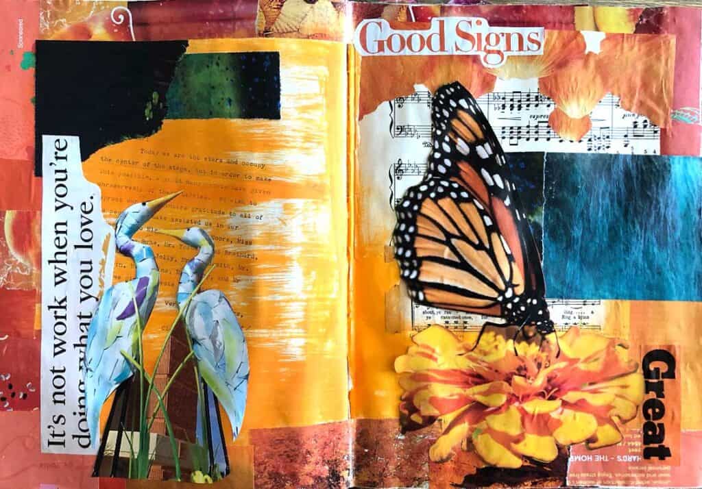
I really liked how the main elements went together. I had all these pieces cut out already so I was super happy to use my stash up a little bit!
A couple of things that I noticed that I didn't like was that the text with the white background was taking away from and competing with the main focal points.
I also thought that the butterfly wings were fading into the blue color block a little bit too much, making it hard to really see her.
This was the first time that I actually wrote thoughts on a journal page, so I was a little freaked out about "messing" it up, but I think it came out great when I had done all the shading and writing!
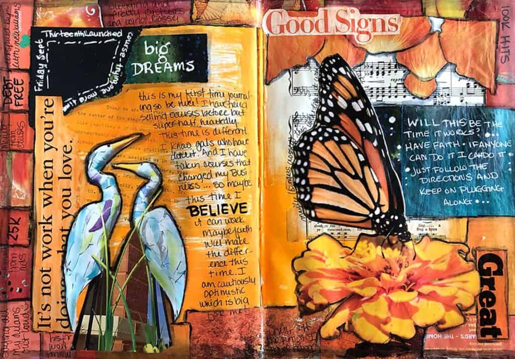
I watercolored the white backgrounds on the printed words so you can still see them, but they are supportive rather than being a major feature of the piece.
I also used white to highlight the division between the butterfly and the color block and outlined the flower and the birds in Stabilo so they could pop out a little more.
I was reminded again how much I like the Signo White Uniball pens for writing on magazine pages.

