Dang, there is a LOT of controversy about what complimentary are. In color theory there are only 3 complimentary colors... the ones across the color wheel from the primary colors. But in art, there are many more complimentary colors you can use!
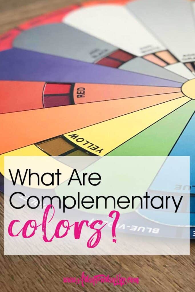
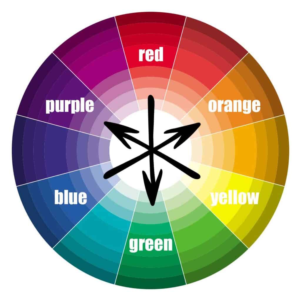
Official Complimentary Colors
Officially the complimentary colors are across the color wheel from the 3 primary colors of red, blue and yellow.
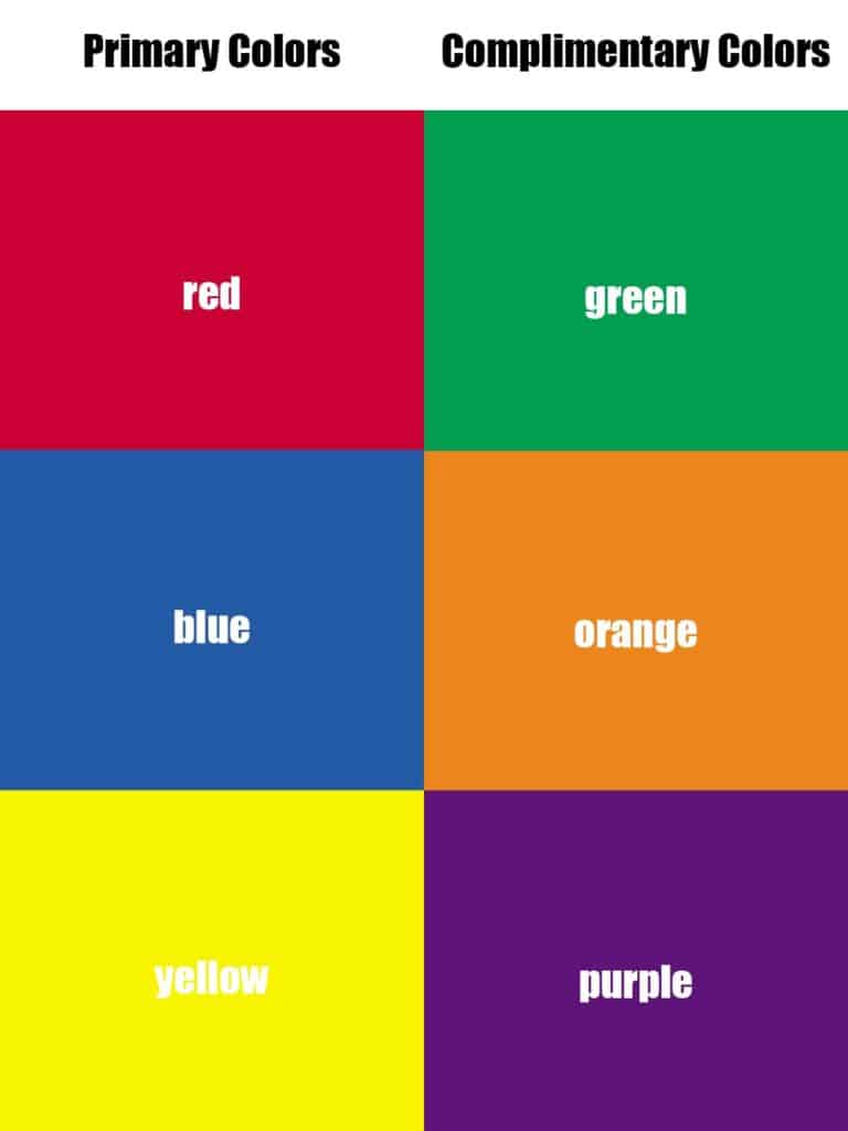
A neat thing is that they are a mix of the other two primary colors. So...
- Red Complimentary - Green (Blue+Yellow)
- Blue Complimentary - Orange (Red+Yellow)
- Yellow Complimentary - Purple (Red + Blue)
How To Make Complimentary Colors
The three complimentary (also called secondary colors) are:
- Green - How To Make Green
- Orange - How To Make Orange
- Purple - How To Make Purple
Complimentary Colors In Action
There are so many different real life examples of complementary pairs being use in the real world...
Think Christmas, the Minnesota Vikings and the Fanta logo. These all use bold colors that work perfectly together!

But since I am writing this post for me so I can easily find good color combinations of colors to use in my artwork, we are going to look at ALL the color circle combinations!
For example, this daily journal page had the "official" versions, red and green, but also the colors across the color wheel from the ones side by side next to the primary and secondary colors.
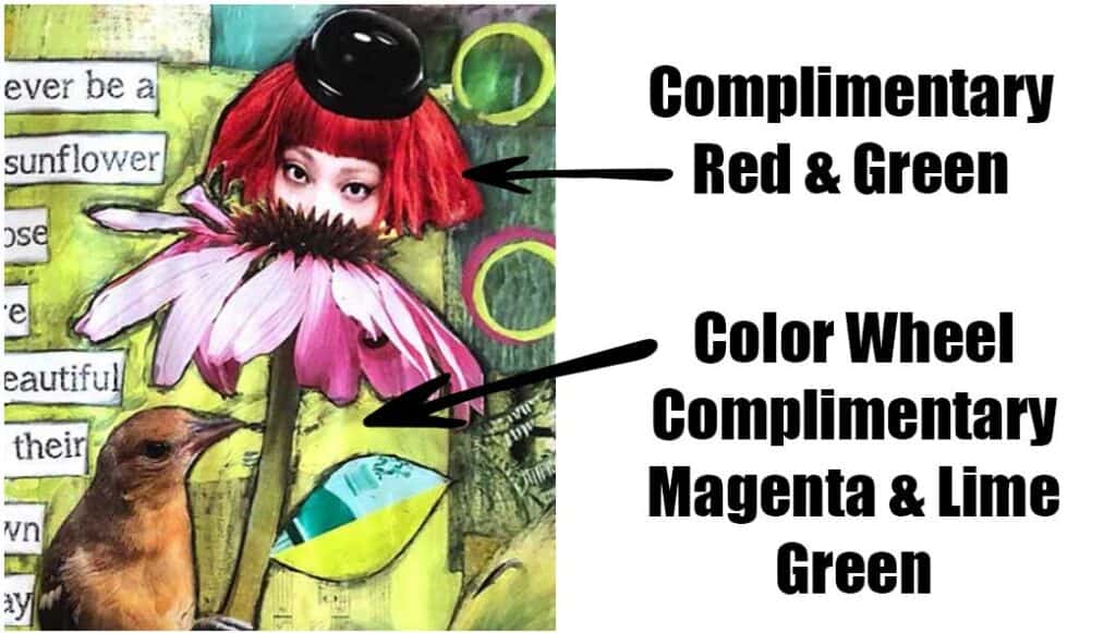
Using complementary colors provides for the highest contrast and makes cool color combinations in your artwork!
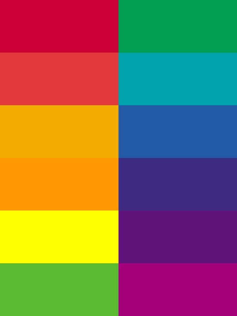
Here are all the colors across the color wheel that you can use in your artwork to provide high contrast...
Tints and Shades
You can make a tint of a color by adding white and a shade of a color by adding black. The resulting colors will all match well with the complimentary tints and shades.
Here are some tints and shades of the primary and secondary colors...
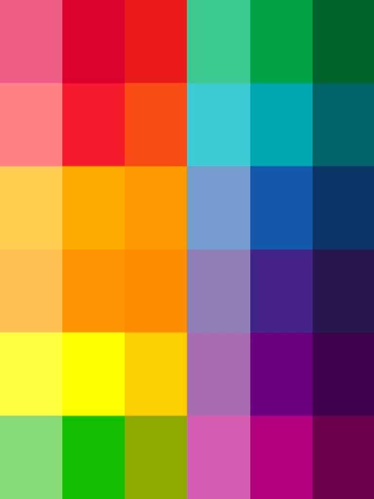
You can read straight across and know that those colors will be a great match in your artwork!
What are colors across the color wheel called?
So going with our colors above we have:
- Red complimentary color is green
- Salmon (light red/dark pink) complimentary color is teal
- Gold complimentary color is royal blue
- Orange complimentary color is blue
- Yellow complimentary color is purple
- Lime green complimentary color is magenta
Complimentary Colors FAQs
People have so many feelings about color theory! Here are a few things you might be asking yourself about these colors!
There are just three main complimentary colors green, orange and purple. There are so many if you get good at figuring out complimentary color combinations! They will always help you have high contrast and make your artwork pop!
This one is harder to answer. Red and green look great in Christmas decorating and purple and yellow certainly pop, but do they look good together? I tend to like the primary color more when it is paired with their tertiary colors... so red with blue green (turquoise), and green with gold (yellow red). They aren't so shocking in my artwork.
Complimentary Color Wrapup
Well there you have it! Complementary colors and all their matches.
I have to say that if you can understand how the colors go together you can make some amazing color combinations in your work. I know that once I started understanding color theory a little bit more I feel like became a better artist.
I find that my work has a complimentary background and a contrasting focal point like I did with the flower ladies. That would have been much less powerful had the pink flowers been on any other color than green or lime green!

