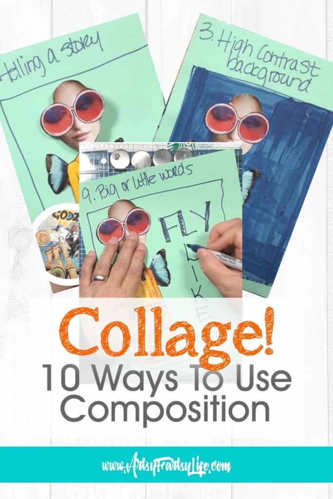
If you love doing collage art and want to up your composition skills, this post is for you! 10 fast and easy tips and ideas to help improve your collage artwork!
Please note: This article contains affiliate links, and that means that I may earn a commission if you buy something. Read my full disclosure here.
VIDEO: 10 Magazine Collage Rules For Composition
Why I Wrote This Post
I have been a graphic artist since 2001, making marketing pictures, advertisements and brochures! All of those require a specific composition to get the viewer to notice things like your call to action or feature image.
What I didn't realize was that this skill would transfer over to my collage artwork. Honestly, I was super surprised how cool my designs looked right from the start, and then realized, DUH, they have good composition so OF COURSE they look better than if I had just thrown some images down on a page all higgldy-piggldy!
10 Collage Composition Rules
So today I am going to share the 10 rules that I use in all my art compositions so you can learn this too!
1. The Rule of Thirds
For this one you want to split up your artwork into a 3X3 grid in your mind. It doesn't matter whether it is a square or a rectangle!
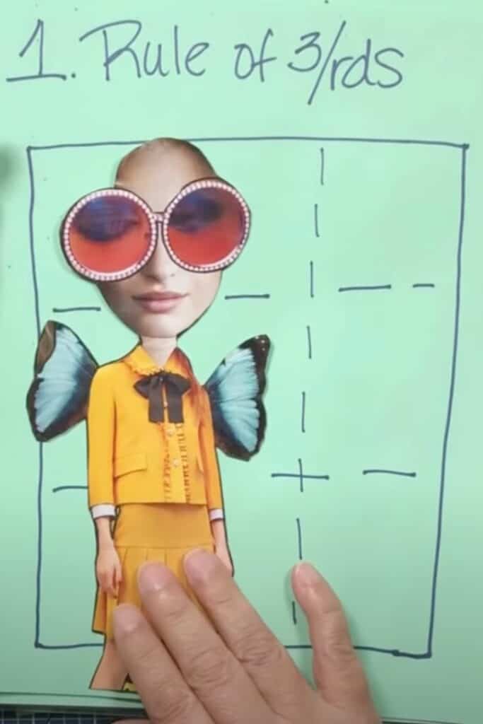
Then line up your focal image along one of those lines rather than plopping it down right in the middle of the page.
This will allow you to have "negative space" around your image to add additional interest or just to let the focal image be the star of the show!
1a. Go Off The Edges
I had to add this one in because so many people are worried about "losing" some of their focal point. But it can be very powerful to have part of the focal image go off the edge of the page!
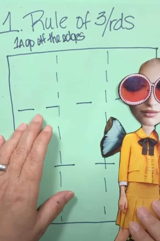
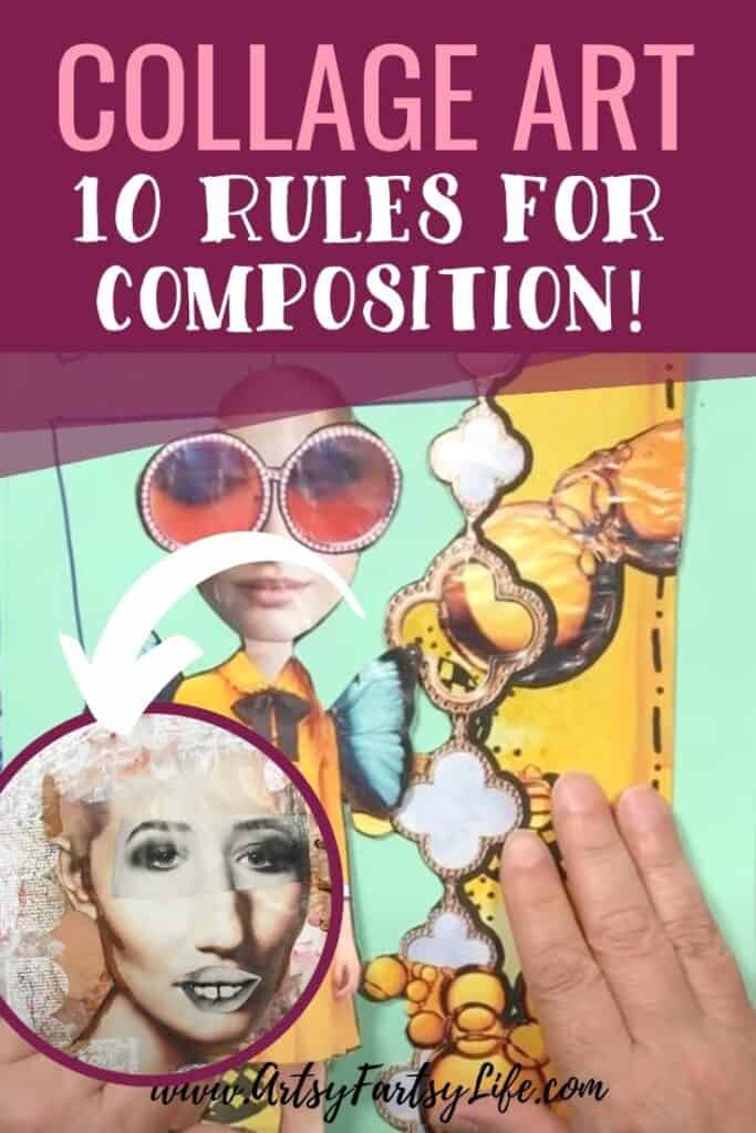
The example I give is that if this gal's wings were HUGE compared to the page, you would switch the focus from her and then the focus might switch over to the huge wings.
You wouldn't be able to have the entire wings on there unless you moved her to the side and had the wings in the middle to show them all!
2. Neutral Background
If you use a neutral background your focal image will be the dominant thing that "jumps" off the page.
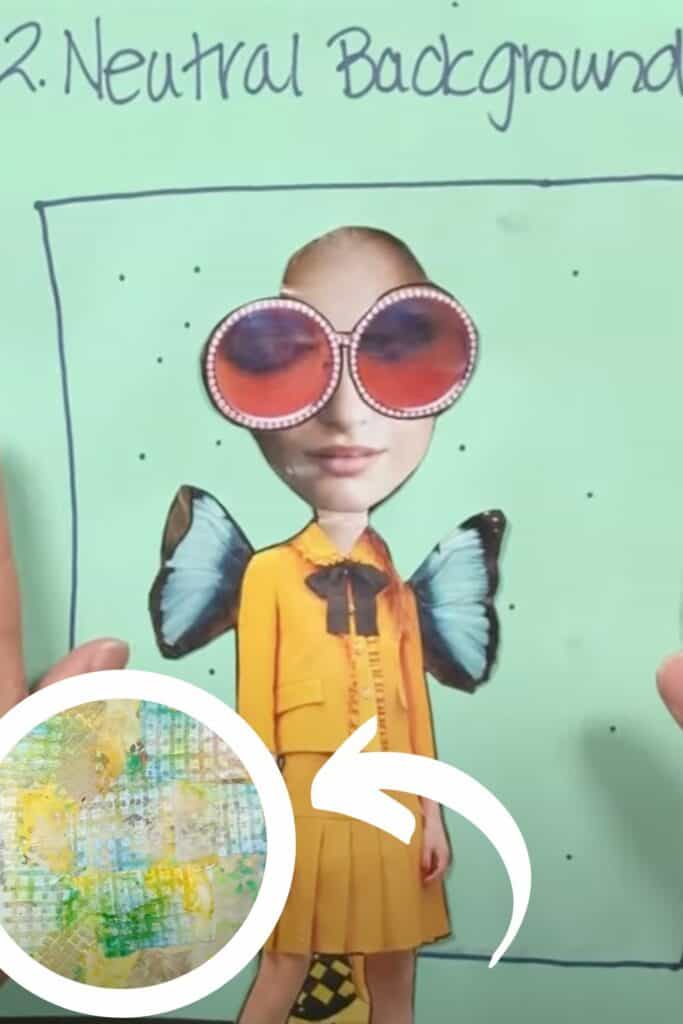
And neutral doesn't have to be boring, it can be textured or have color, just not anything that jumps out to compete with the focal image.
A good way to do this is to squint and blur your vision. If your background seems to have an area that stands out from the rest, then it probably isn't neutral enough!
You will have high contrast with your image!
3. High Contrast Background
For this composition rule you want to have the background be dark or busy to provide a high contrast to your focal image!
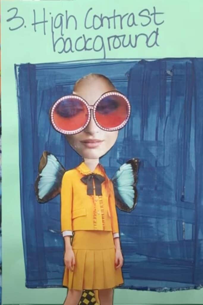
The contrast doesn't just have to come from being dark though, if you used a complimentary color (opposite on the color wheel) you would get the same contrasting effect.
3a. Light At The Top, Dark At The Bottom
Because the world is made this way, this kind of background will make you feel more comfortable.
Light goes at the top and dark goes at the bottom, like the sky is light and ground is dark! Dark feels heavier than light does.
4. Scale
Using scale in my magazine collage might be my favorite way of making absurd things look more realistic or helping my viewer to see what I am focused on.
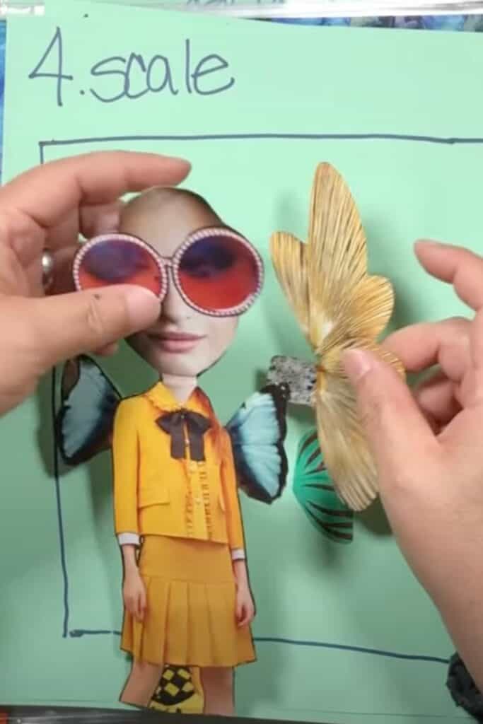
For example, if we traded out her little fairy wings that are an accessory right now for giant wings, then the giant wings become the focal point and the gal is less of a feature.
Another thing about scale is your background images. If you use large background images then they can overtake whatever is in the foreground.
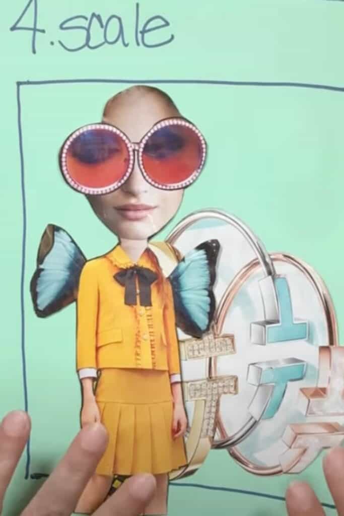
If you use smaller background images then you can have the focus remain on your primary image but have little fun things around for people to look at after taking in your main focal point!
5. Telling A Story
I love to have an idea in my mind about what story I am telling with my collages!
For example, the story of the gal is that she is fun and festive, if I added crazy hair she could be even more so!
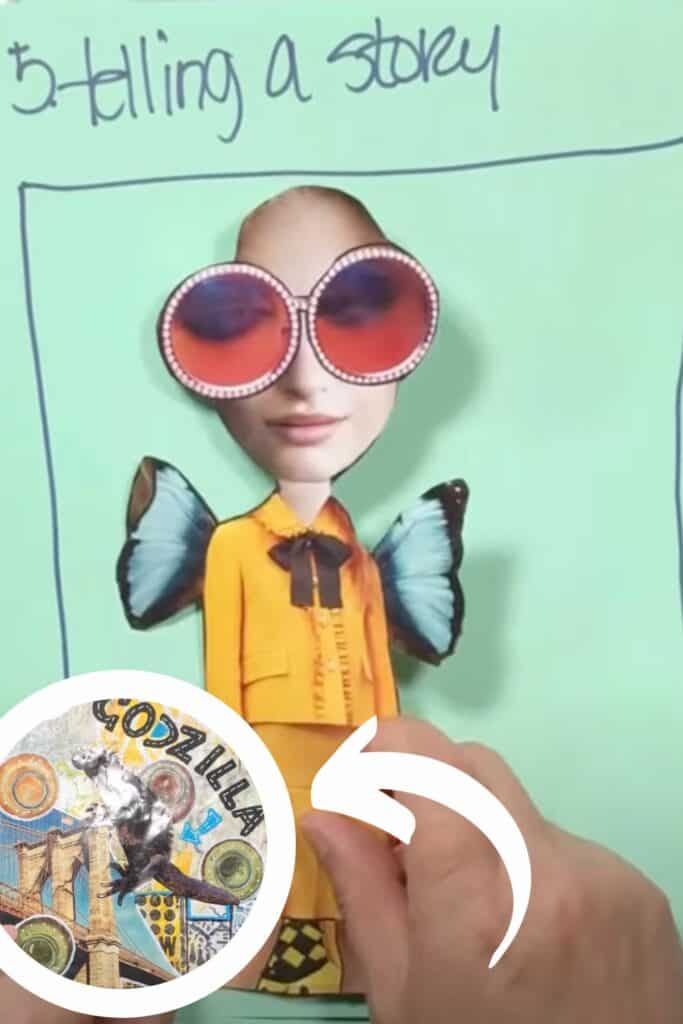
But the story I am telling Godzilla is that he is like the famed movie monsters of old who attacked cities and wreaked havoc! I also used scale to have the lizard be huge while my city background is smaller!
6. Using Color
You can make your collage art very calm by using a monochromatic color scheme (all one color).
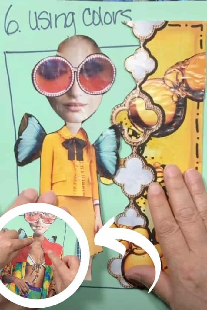
But you can also change the whole feeling of your piece by adding different colors. Simply by adding a different body with bright colors, you can see that this goes from a calm, serene piece to an active, vibrant piece!
7. Having A Focal Point
I know that other kinds of artwork, like abstract, don't have a focal point. But for me, the easiest way to figure out how to lay out my composition is to have a focal point that I can start with.
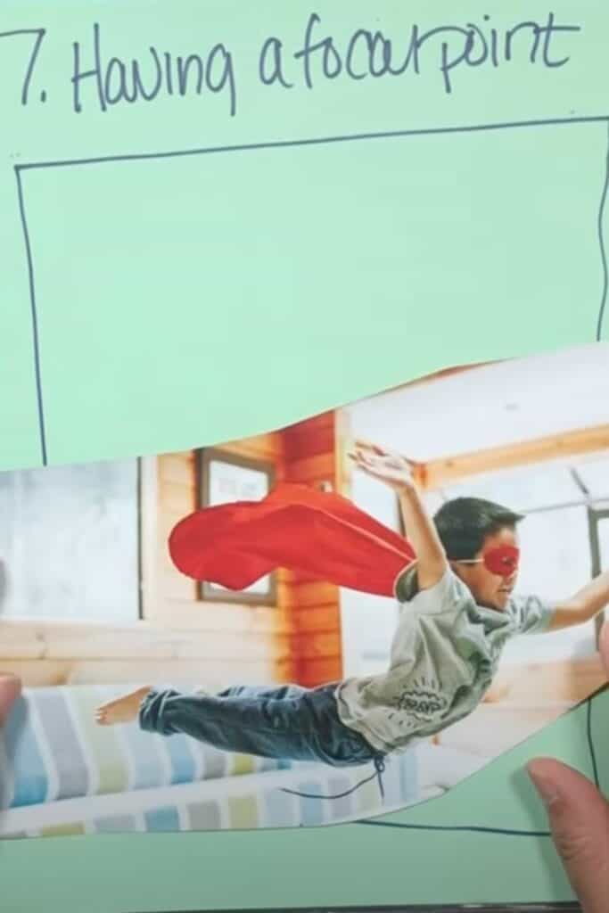
And then think about where you place your focal point. Having this little kid at the bottom of the page feels weird to me because I envision flying things in the air so I would put him towards the top of my artwork rather than down at the bottom!
8. To Border or Not To Border
Sometimes having a border around your collage art adds a hard edge to your artwork.
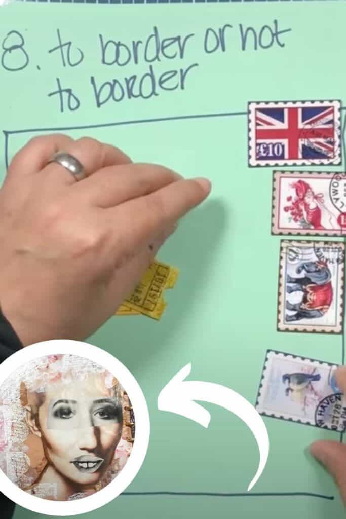
Additionally a border can exist on one side, through the middle or even be part of the background while still framing your focal point in an interesting way!
9. Big Words or Little Words
If you are writing in your journal or cutting out words from magazine, it is important to know how the appearance of those words is going to affect the focal image in your artwork.
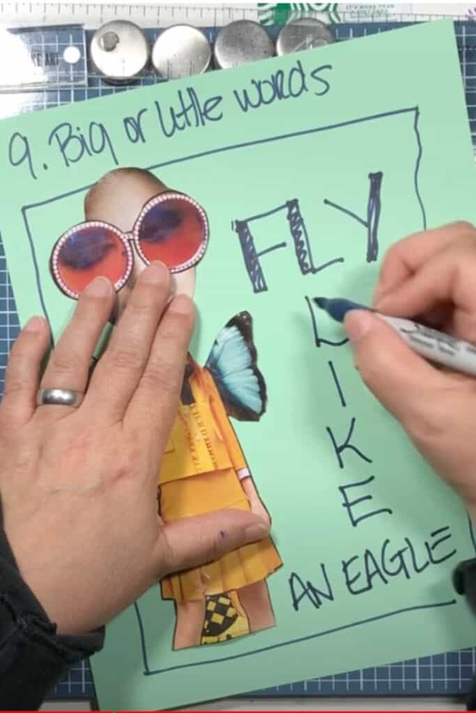
Pro tip... if you can, have the person look at your words with their eyes!
10. You Do You!
Last but not least, if you have a way of doing your art that you love, stick with that!
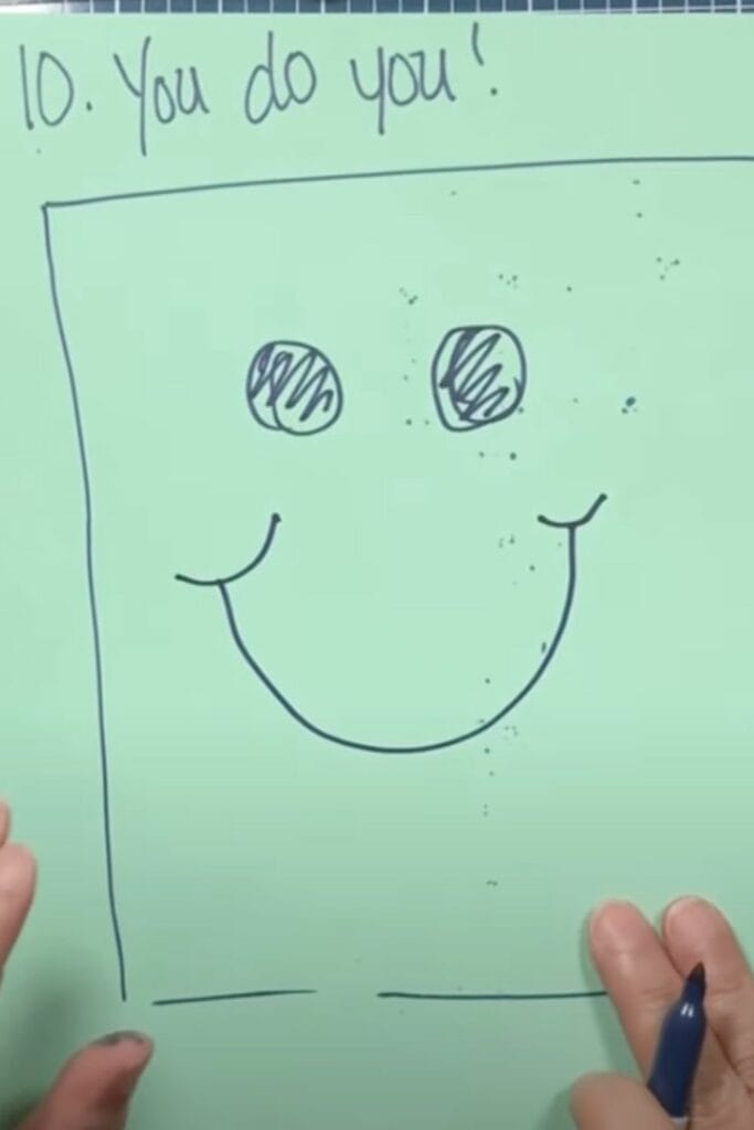
Instead of trashing everything you do, pick a rule or two, try them to see if you like it in your art and then maybe try another two or so!
Composion Rules For Collage Art Wrapup
Whew, that was a lot of rule talk! I hope these rules help you to design art that is more pleasing to you or your viewers.
I didn't write this post to be all preachy, I wrote it to help you compose your art in a way that is better designed and well thought out!
Here are some more magazine collage posts that you might like!
- Working On My Tim Holtz Mini Magazine Collage Journal
- How To Make Magazine Collage Hair – Art Tutorial
- How To Paint On Magazine Collage – Mixed Media Tips
If you are looking for more help with collage, I have a free magazine collage course that you might want to check out next!
